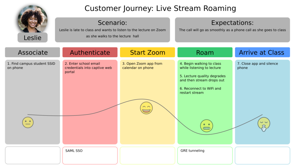
This was developed as a sample (no client) using InkScape on Ubuntu Linux 22.04. Woman image credit: Mizuno K on Pexels.com. Emoji credit: openmoji.org.
This was developed as a sample (no client) using InkScape on Ubuntu Linux 22.04. Woman image credit: Mizuno K on Pexels.com. Emoji credit: openmoji.org.
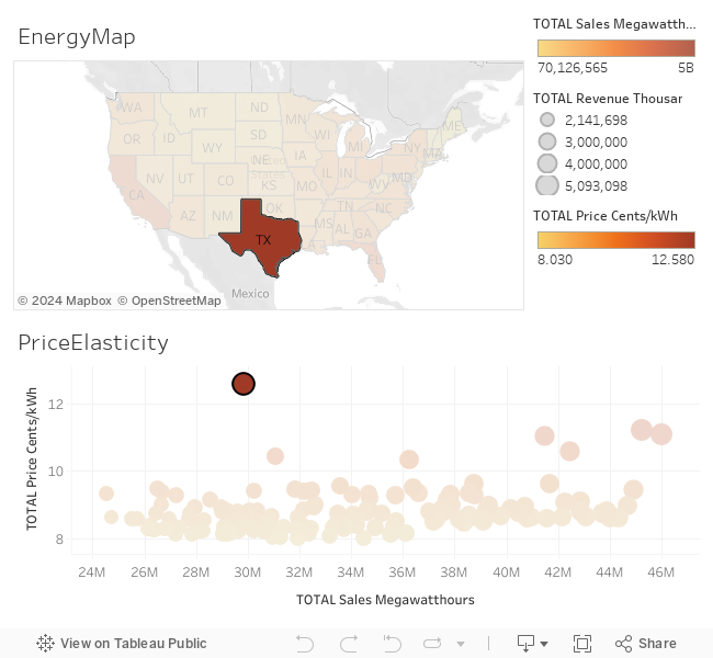
This is an experiment in using Tableau for visualization. Data is from the US EIA.
Analytics dashboards are interfaces for viewing, interpreting, and exploring summaries of complex data. Dashboards may be used to report on the status of complex systems such as those found in large scale business, scientific, or logistical operations. Dashboards often combine multiple charts in a single view to be printed or viewed on a screen. Charts are named patterns for ways to create graphics to represent data. Different types of charts (line, bar, pie charts), and components of charts (title, legend, axis) are easy to create using software packages. Certain of these ways of representing data are widely useful in a variety of applications, so we call these “patterns”. However, there are many commonly used charts and chart components that are poor at accomplishing their intended purpose, or are often abused by using them for the wrong purpose. We call these “anti-patterns”. What follows are some examples of anti-patterns for analytics dashboards, and some suggested alternatives.
Please note, though, that all of these patterns and anti-patterns have situations where their usage is merited. These are simply some cases where there are some other alternatives that should be considered.
Pie charts are some of the most commonly used data visualizations in business settings. However, this type of visualization is almost always suboptimal for a given task, or abused to the extent that it should
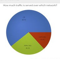
This is a technical whitepaper I authored while at Ubicom. In addition to authoring the paper, I designed the benchmark, ran the tests, and did graphic design and layout for the paper. Tools used were Ixia IxChariot, MS Excel, MS Word, and other tools.
OPScore Whitepaper

This is a diagram describing the software globalization process. This was developed for Aeontera, Inc. Developed in Adobe InDesign CS4. Click to download a PDF version.
Video promoting Ubicom’s QoS technology for streaming media over a wireless network. I produced this using Adobe Premier, Photoshop, and Cubase SX3. It even includes an original music track!
