Introduction
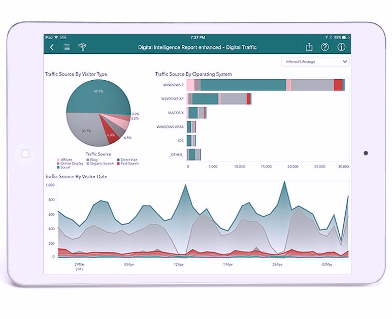
Analytics dashboards are interfaces for viewing, interpreting, and exploring summaries of complex data. Dashboards may be used to report on the status of complex systems such as those found in large scale business, scientific, or logistical operations. Dashboards often combine multiple charts in a single view to be printed or viewed on a screen. Charts are named patterns for ways to create graphics to represent data. Different types of charts (line, bar, pie charts), and components of charts (title, legend, axis) are easy to create using software packages. Certain of these ways of representing data are widely useful in a variety of applications, so we call these “patterns”. However, there are many commonly used charts and chart components that are poor at accomplishing their intended purpose, or are often abused by using them for the wrong purpose. We call these “anti-patterns”. What follows are some examples of anti-patterns for analytics dashboards, and some suggested alternatives.
Please note, though, that all of these patterns and anti-patterns have situations where their usage is merited. These are simply some cases where there are some other alternatives that should be considered.
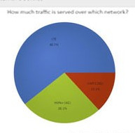
Anti-Pattern: Pie Chart
- Strengths: Emphasizes data is normalized, and highlights partitions of data (“slices”) with largest share
- Weaknesses: Difficult to compare partitions of data (“slices”) to each other, difficult to label and compare smaller partitions, particularly with large number of partitions
- Try Instead: Bar chart
Pie charts are some of the most commonly used data visualizations in business settings. However, this type of visualization is almost always suboptimal for a given task, or abused to the extent that it should almost never be used. In fact, people have written articles titled “Friends don’t let their Friends use Pie Charts”. Pie charts are very good at two things: The first is making it obvious that the data is normalized (scaled to 100%). The second is it is usually easy to see that one or a few pieces of data have a majority of share of the whole.
The weaknesses of pie charts are numerous: The fact that the data has been normalized, or the individual data make up a whole is almost never very interesting during analysis. Second, it is very difficult to visually compare the size of the “slices” of the pie because they must mentally rotated about the center of the pie to compare them. Third, it is very difficult to derive any meaning data with a small share. It is difficult to compare or see the labeling of these small slices. The situation can be made even worse by a legend. Now the analyst has another level of redirection in understanding the graphic by matching the key of the legend with the pie slices themselves.
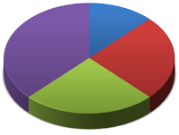
The most extreme example of this anti-pattern is the 3D pie chart. The original 2D pie chart is transformed into a 3D representation, and then projected back down to the 2D screen or page. This causes distortion in the radius and area of the slices, making it even harder to compare them.
Almost all pie charts can be replaced by more effective bar charts. If the normalization of the data is important, this can be pointed out in the title or axis label of the chart. By aligning the bars along an axis in a cartesian coordinate system, it is much easier to compare the lengths of the bars.
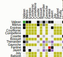
Anti-Pattern: Color Keyed Legend
- Strengths: Prevents interference between data and labels
- Weaknesses: Color keys not accessible for those with color blindness or those with monochrome output devices, adds level of redirection between data and labels
- Try Instead: Direct labeling of data, axes, or facets (tiled plots)
Legends are components of many types of charts. They are problematic for various reasons. First, they introduce a level of redirection between the representation of data and their categorical label. The viewer’s eye has to constantly dart back and forth between slices in a pie chart, and the keys in the legend of the chart, for example. Second, if the legend is keyed purely on the basis of color, the chart will be inaccessible to people that are color blind or who use monochrome output devices (screens and printers). Plus, even non-color blind individuals may not be able to interpret a chart with a large number of keys because the colors cannot be distinguished.
A better alternative to color keyed legends is to design visualizations that directly label data, axes, or facets (tiles of plots, etc).
Anti-Pattern: Stacked Bar Chart
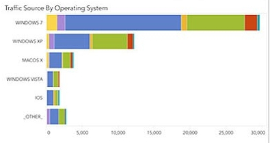
- Strengths: Easy to compare magnitude of subtotalled data (“stacks”)
- Weaknesses: Difficult to compare magnitudes within partitions, or data with same type
- Try Instead: Trellis or table of bars or bar charts
Stacked bar charts set the origin of each bar as the top of bar of the previous category. This makes it easy to see changes in the total of all of the categories. However, it does this while making it more difficult to see changes within each category. This is consistent with a theme in these anti-patterns of emphasizing an overall property of the data, while making more granular insights more difficult.
Anti-Pattern: Multiple Line Chart
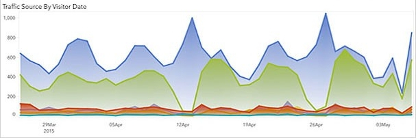
- Strengths: Good for comparing values across time in different category
- Weaknesses: Difficult to compare data sets with different scale, overlapping of lines obscures data and trends, sampling may be misinterpreted as trends
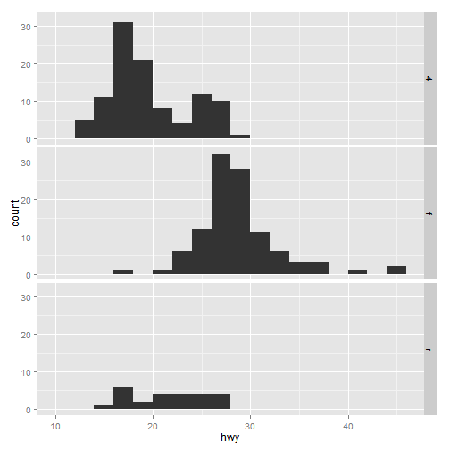
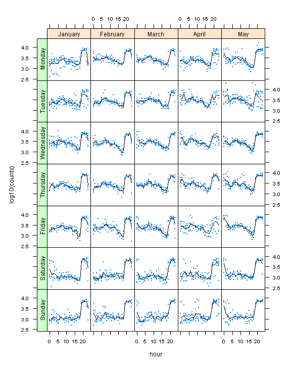
- Try Instead: Trellis of dot plots with smoothing lines
Multiple line charts are seen quite often on dashboards. They show different categories of data changing along an axis. Multiple line charts can be problematic, however. The lines for each category are superimposed on each other. This can make it difficult to distinguish data in one category from another. Line charts are more common in business dashboards than in scientific papers. Connecting each data point with a line creates a false impression that a linear trend is followed between each data point. A line chart with lines jumping up and down between data points can make the data appear “noisier” than it is. In many cases, this jumpiness is due to sampling intervals, and is not a trend in the data. For instance, a customer may place a large order on a particular day each month, that would cause a spike in a line chart of daily samples, but would not show up in a monthly sample.
Anti-Pattern: Normalized Stacked Bar Charts
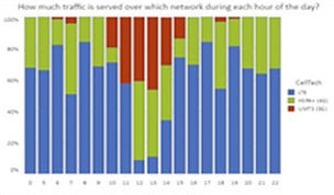
- Strengths: Emphasizes normalization of data and change in share along a dimension
- Weaknesses: Difficult to compare data of the same type along the axis, except for top and bottom types of the stack
- Try Instead: Grid of bar plots
Unlike a regular stacked bar chart that emphasizes the total for each stack, the normalized stacked bar chart fixes the scale for the height of the stack to 100% of share. This pattern is normally used to show change in share between data against an axis. However, the translation of each bar to stack on top of the previous bar makes it difficult to compare data of the same type along the axis. A better alternative would be to anchor each bar in a grid. Data can then be compared within or between dimensions by looking along the axes.
Anti-Pattern: Tag Cloud
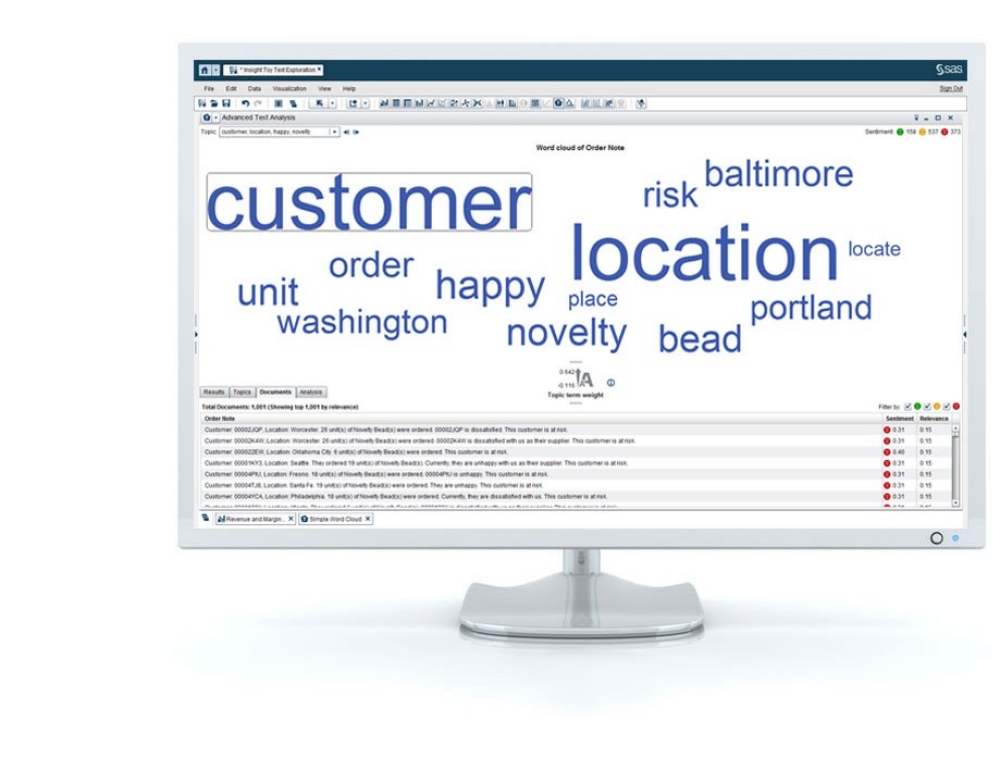
[Source: http://www.sas.com/en_us/software/business-intelligence/visual-analytics.html]
- Strengths: Emphasizes key words, encourages free association in interpreting tag or keyword relationships
- Weaknesses: Difficult to compare similarly weighted tags. Small tags may be too small to read, large tags may take up unnecessary space, placement is random
- Try Instead: Density Co-Occurrence Matrix
Tag clouds randomly place tags or words in a plot, and adjusts the font size for each word according to a weighting factor. The weighting factor could be TF-IDF (term frequency – inverse document frequency), a weighting factor that increases weight for uncommon words, but underweights very common words in a corpus. Tag-clouds are anti-patterns for analysis, because they make it difficult to compare similar levels of weighting for different tags, and the font scaling can make lower weight tags difficult to read. For analysis and exploration, a simple weight-ordered list is much more efficient and usable. Instead of using tag size to express weight, the weight value can simply be added to the list as a column. The extra space saved can be used to show other metrics for the tags or to add facets to the plot.
The original tag cloud implementations such as Wordle, did not cluster tags based on their relationship to other tags. Instead, the tags could be listed on each axis of a co-occurrence matrix. A co-occurrence matrix show how often a pair of tags or tokens appear together in a window or interval in a corpus. The tags could be sorted by weight, then the co-occurrence frequency could be used to set the density of each cell in the matrix.
Anti-Pattern: Waterfall or Bridge Chart
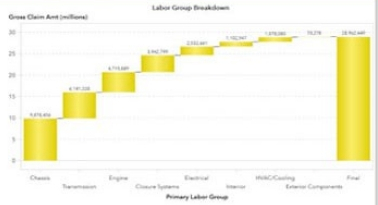
- Strengths: Clearly shows relationship between totals and subtotals
- Weaknesses: Difficult to compare magnitude of subtotals
- Try Instead: Trellis of Bar Charts
Waterfall or bridge charts are common in financial analysis. It is a variant of a bar chart where the origin for each bar is the top of the previous bar along the axis. It is often used to show how the sum of cash flows in a period equal the change in the balance sheets across that period. It is used more generally to show how a sequence of incremental changes accumulate into an overall change in state. It suffers the same weakness as other bar charts where the bars are translated off of the axis. It makes the values more difficult to compare. It emphasizes an overall property of the data, that totals are the sum of subtotals, at the expense of easily analyzing the subtotals. A better alternative would be to separate the plot into a trellis of bar charts, with separate rows for the total and subtotal data. This way, the two categories of data are not co-mingled on the same axes.
From Anti-Patterns to a Grammar of Graphics
If these anti-patterns represent things you normally shouldn’t do, what is it that you should do when creating plots for dashboards? The first step is to ask what sort of patterns and relationships should be highlighted in the data. Also, how might the plots be explored? Once these and other questions are answered, a visualization can be constructed based on a grammar of graphics. A grammar is a set of rules that are part of a more flexible graphics framework. Modern tools such as ggplot2 (for R), D3 (for Javascript), and Tableau (a commercial tool) allow for very flexible dashboard creation. This allows plots to be tailored to the specific analytics use case needed for the dashboard.
Further Reading
GGPlot2 Book, Hadley Wickham
The Grammar of Graphics, Leland Wilkinson
The Visual Display of Quantitative Information, Edward Tufte