Introduction
Analytics dashboards are interfaces for viewing, interpreting, and exploring summaries of complex data. Dashboards may be used to report on the status of complex systems such as those found in large scale business, scientific, or logistical operations. Dashboards often combine multiple charts in a single view to be printed or viewed on a screen. Charts are named patterns for ways to create graphics to represent data. Different types of charts (line, bar, pie charts), and components of charts (title, legend, axis) are easy to create using software packages. Certain of these ways of representing data are widely useful in a variety of applications, so we call these “patterns”. However, there are many commonly used charts and chart components that are poor at accomplishing their intended purpose, or are often abused by using them for the wrong purpose. We call these “anti-patterns”. What follows are some examples of anti-patterns for analytics dashboards, and some suggested alternatives.
Please note, though, that all of these patterns and anti-patterns have situations where their usage is merited. These are simply some cases where there are some other alternatives that should be considered.
Anti-Pattern: Pie Chart
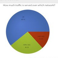
- Strengths: Emphasizes data is normalized, and highlights partitions of data (“slices”) with largest share
- Weaknesses: Difficult to compare partitions of data (“slices”) to each other, difficult to label and compare smaller partitions, particularly with large number of partitions
- Try Instead: Bar chart
Pie charts are some of the most commonly used data visualizations in business settings. However, this type of visualization is almost always suboptimal for a given task, or abused to the extent that it should